Little Feminist
Clarifying the value proposition to increase readership
Discovery Research | Usability Testing
Project Overview
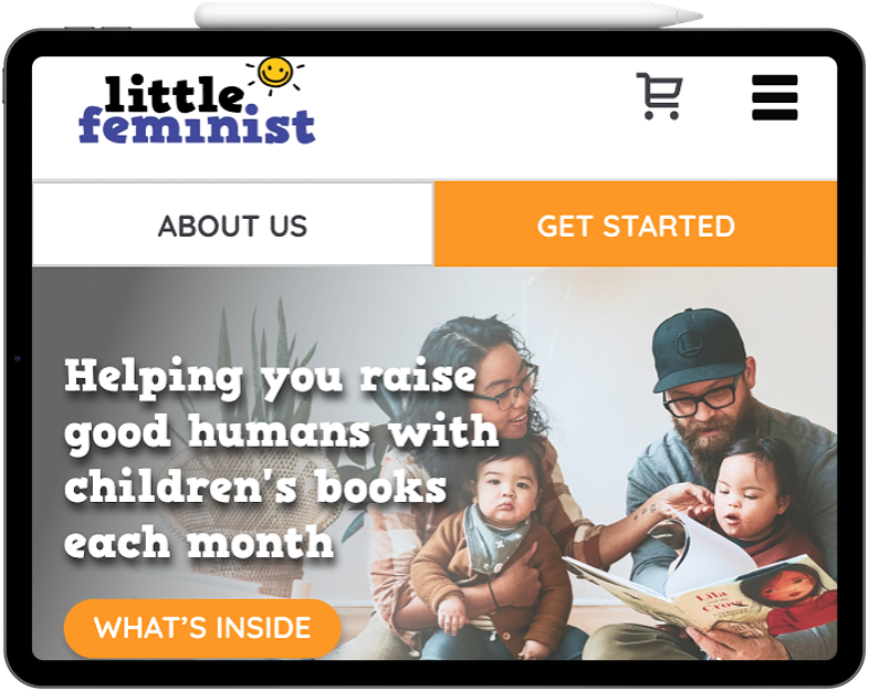
Client: Little Feminist is a monthly book subscription service with themes of inclusion and diversity to teach children about their outside world.
My role: Co-Lead (Project Manager), Lead Researcher, UX design support
Timeline: 7 weeks
Tools: Pen/paper, Figma, Zoom, Google Hangouts, Miro, Trello
Research methods: Benchmark usability testing, discovery research, moderated remote testing
Deliverables: Mid-project report outlining major issues and projected design scope, Hifi prototypes
The problem
Little Feminist approached us with the concern of the website experiencing a 42% dropoff from the homepage and wanted to know what major issues could be contributing to the high dropoff rate. Little Feminist believed the home and product page were driving away potential new subscribers and wanted to know what could be done to address these issues.
Strategy
As a co-Project Manager and lead researcher for this project, my approach was to create a research plan that would allow the team to conduct two critical rounds of research; the first round to uncover the major issues and the second round to validate changes the design team made.
I wanted to begin with evaluative research to determine users’ current understanding of the website and product. Keeping in mind what the main issues the client wanted to solve were, I ensured to also include specific usability goals. This initial test would be crucial in determining the course of action of updating the website’s copy, UI, and navigation to make clear Little Feminist’s value proposition and to decrease the amount of time it takes users to navigate to the product checkout page.
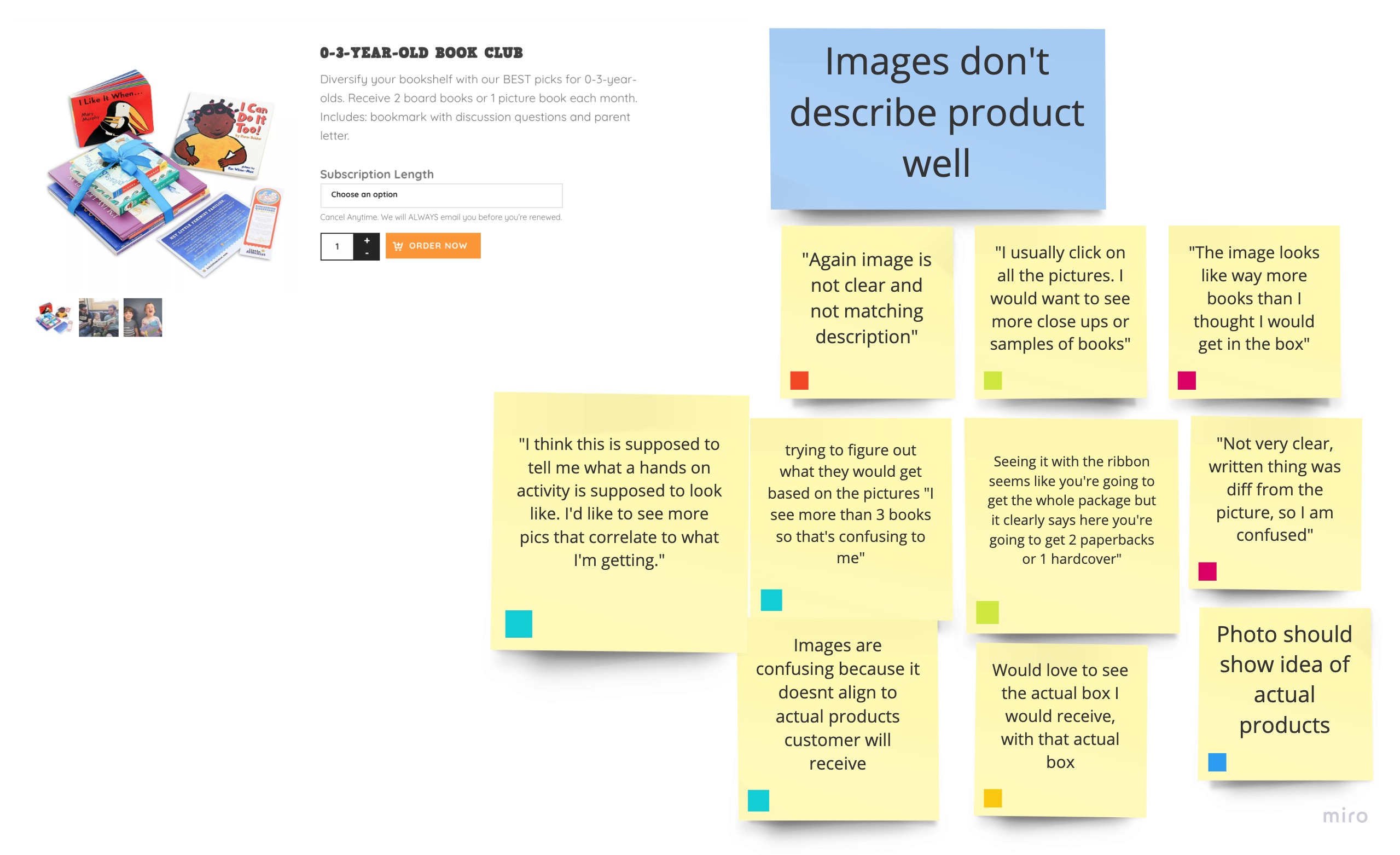
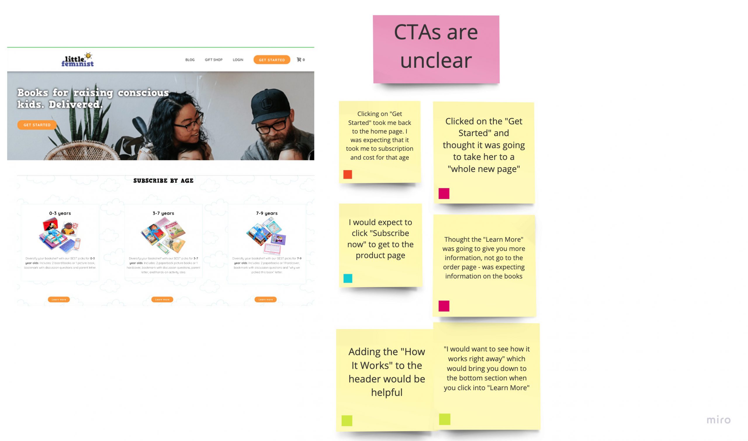
Upon conducting initial user research, we discovered that users found the value proposition unclear and misleading due to inconsistent copy and visuals that were offbrand.
My process:
- Competitive analysis and website analytics
- Understanding users’ needs and goals
- Defining the problem statement
- Designing wireframes
- Testing design iterations
- Applying user feedback and handoff
- Learnings
1. Competitive analysis and website analytics
To start off our project we conducted a Google Analytics deepdive to determine the website’s bottlenecks and dropoff points. We now knew when and where the problems lay but would rely on speaking with users to determine why users were encountering issues.
Little Feminist had already conducted competitive analysis so we had a view of the product landscape but we conducted comparative research to get a sense of other subscription service experiences to help inform our design decisions.
2. Understanding users’ needs and goals
The next step was to conduct user research to investigate what the major issues of navigating the Little Feminist website were and why. Screener questions were created to ensure we performed research with the right types of users. In this case, it was important we screened for those who had never heard of Little Feminist, and who were interested the company’s products (ie children’s books that cover culture, diversity etc.). The discussion guide was written to gather generative insights so the discussion would be very much free-flowing, although there were certain key steps we wanted to see if users could perform.
We conducted remote 1:1 interviews with 7 users and performed affinity mapping to determine the major pain points and to prioritize which issues to focus on.
Key Findings:
- The website’s conflicting visuals and copy left users confused about what was on offer
- Users were unclear how the subscription process worked
- Unclear CTAs lead to confusion in navigation
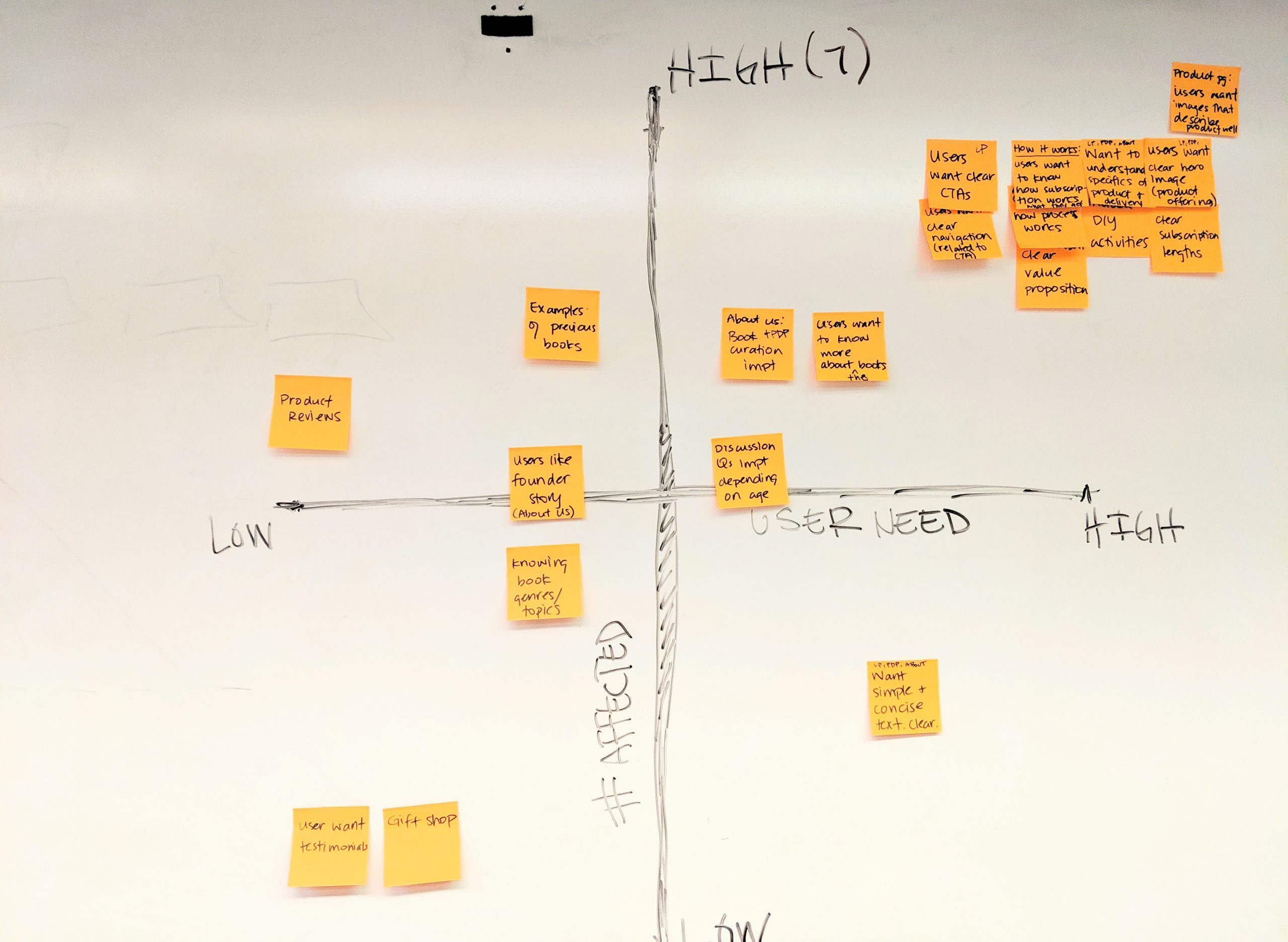
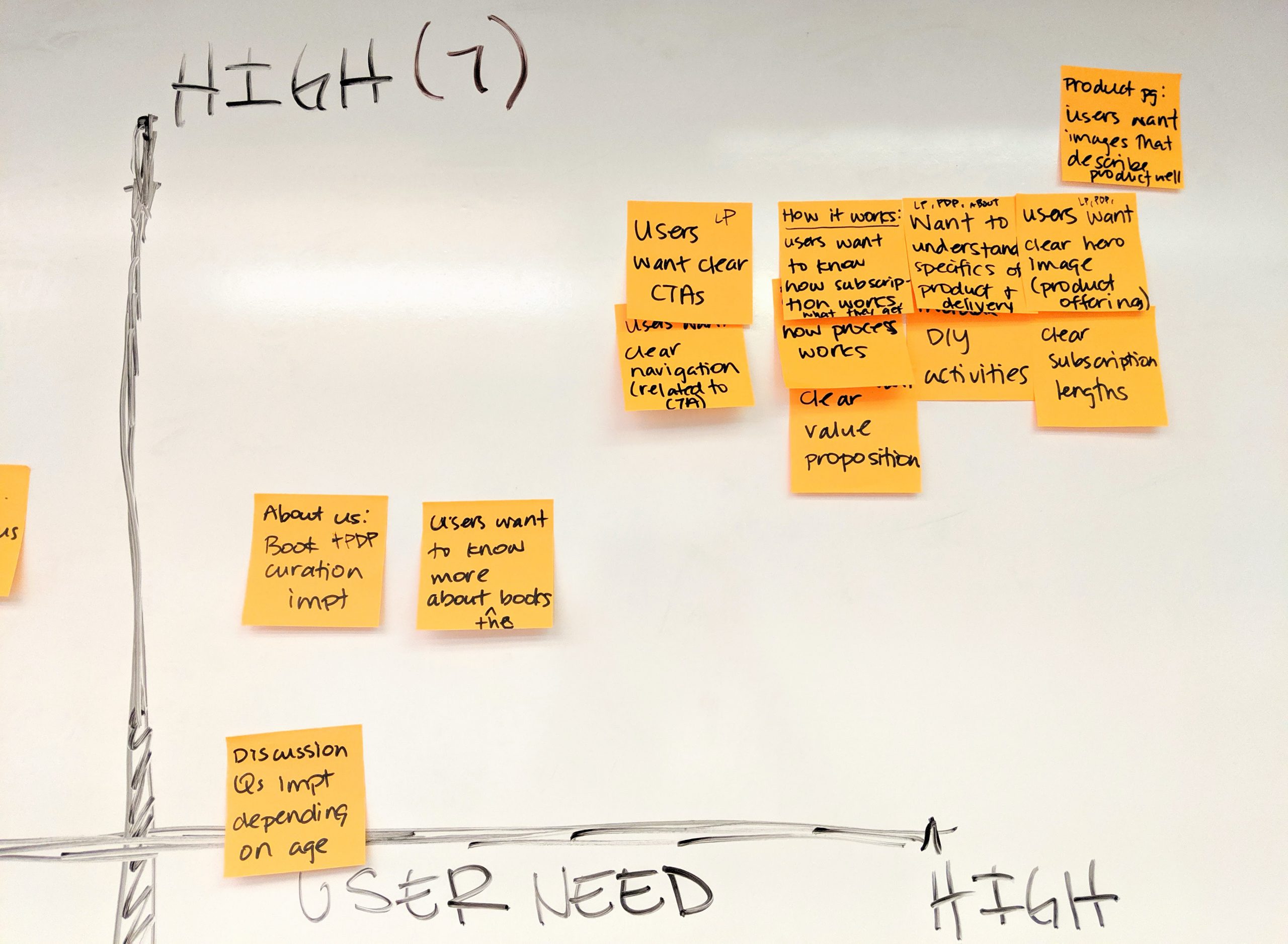
Matrix: User Need x # of Users Affected
Focusing on top right quadrant: High user need and high number of users affected
3. Defining the problem statement
Now that we understood what the problems were we could frame our statements to solve it.
- How might we redesign the homepage and product page so users are clear what Little Feminist’s product offering is and what they will receive?
- How might we redesign the subscription plan section to make clear what the differences in price and subscription lengths are?
- How might we improve the navigation experience to meet users’ expectations?
4. Designing wireframes
The next step of the process was to brainstorm on how to tackle our ‘How Might We’s’. We sketched out ideas and the designs we went with were those that performed best in our dot voting sessions. I collaborated with the UI designers as they created hi-fidelity designs that stemmed from user feedback and best design practices for eCommerce websites. As we were creating for a responsive website, designs were for both mobile and desktop.
From ideation...
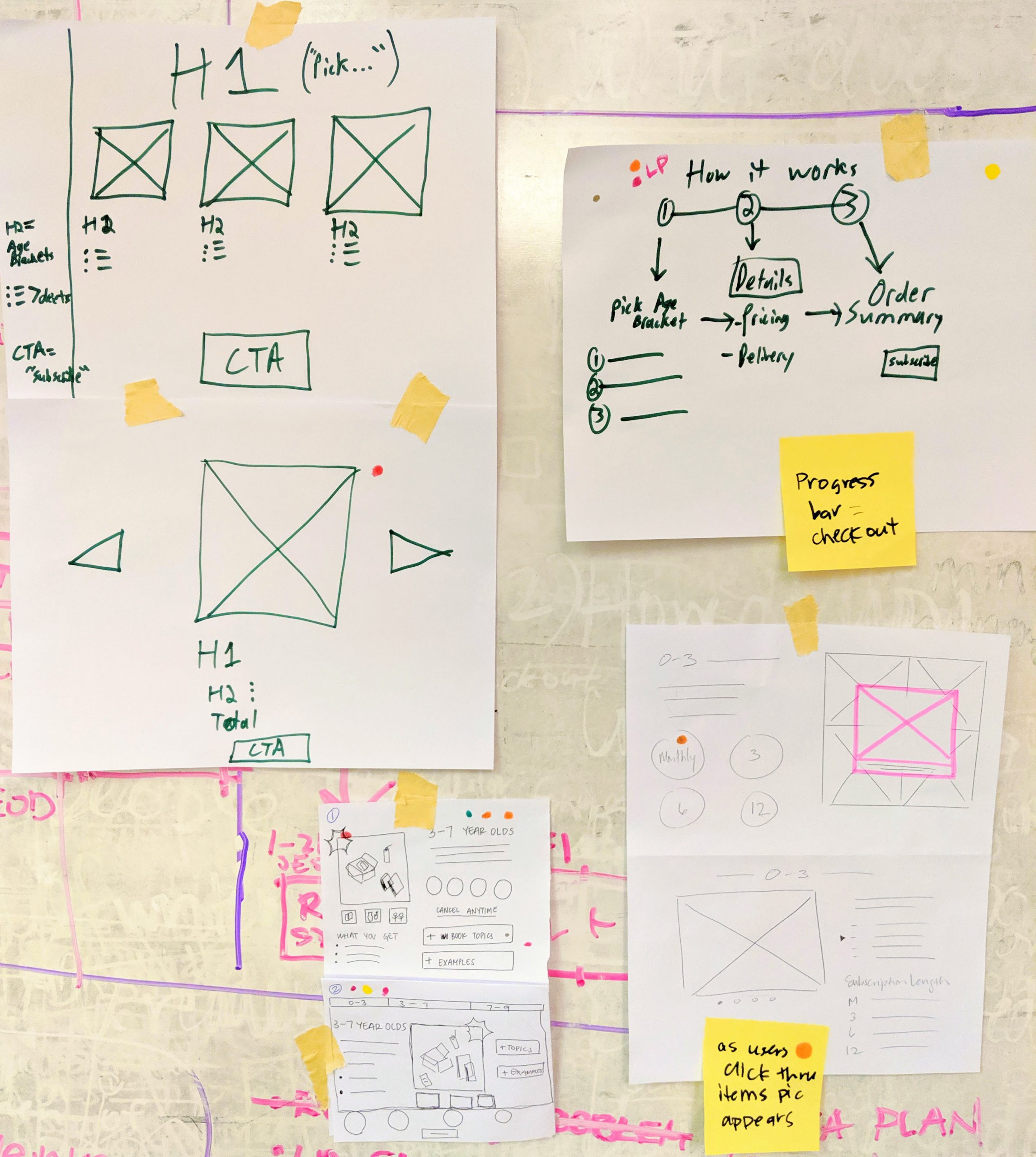
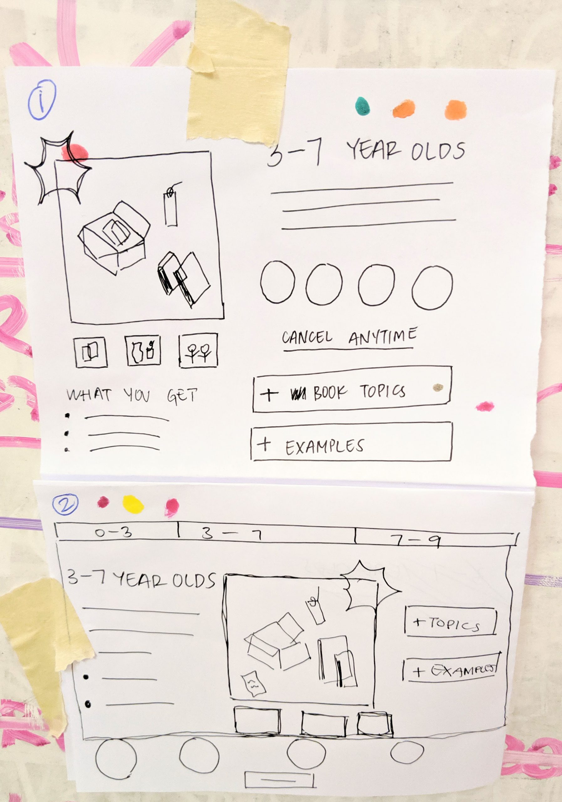
...To sketching
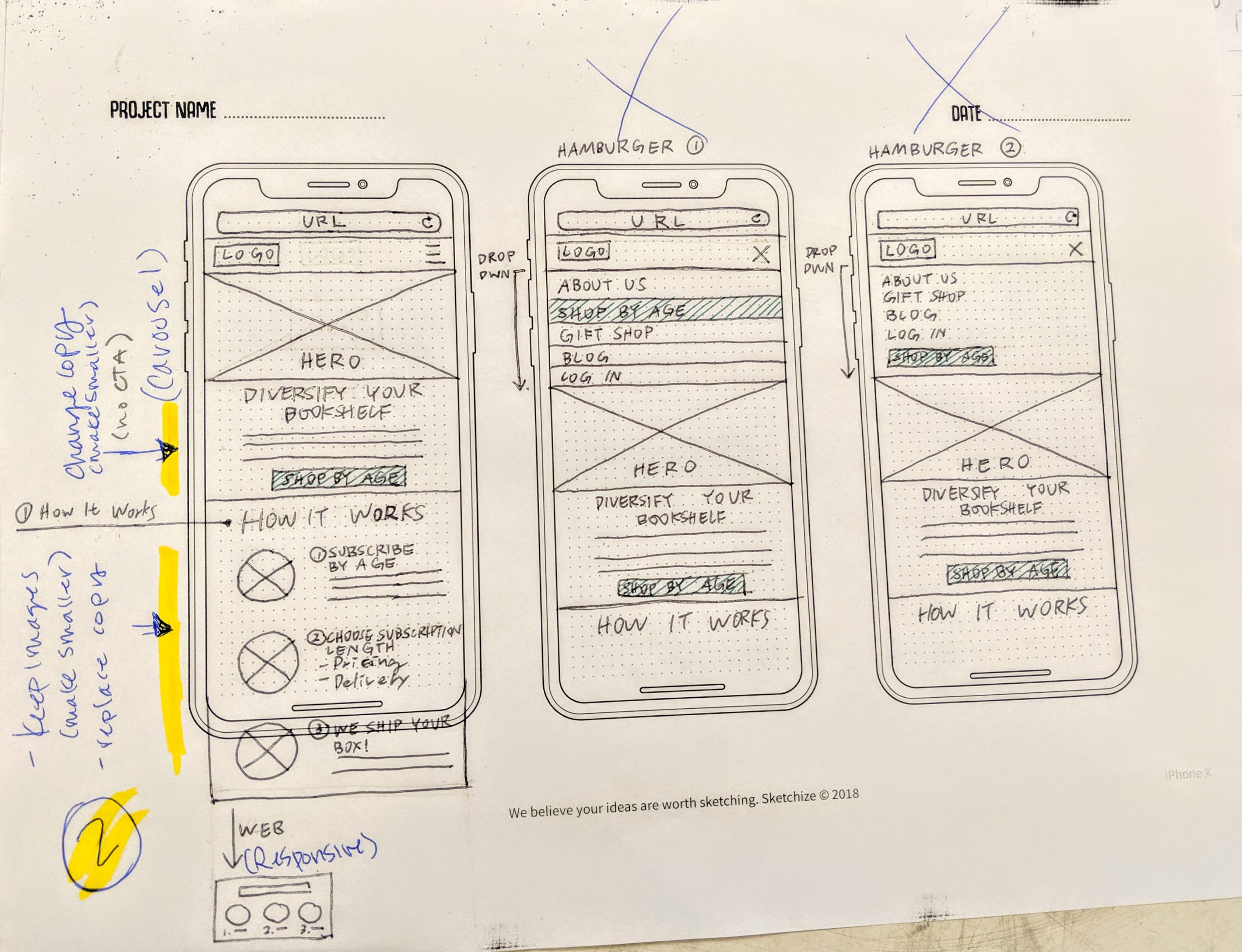
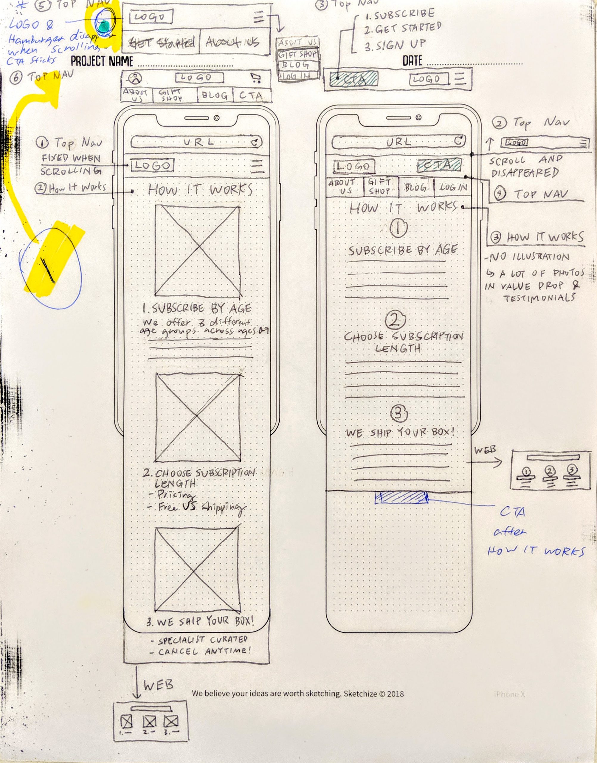
...To first iteration of HiFi wireframes
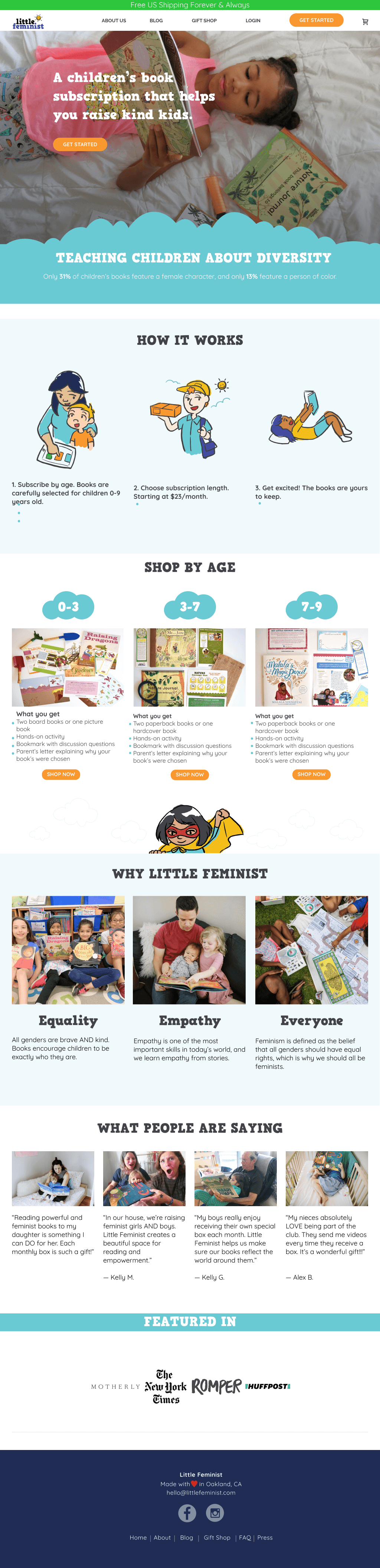
Homepage
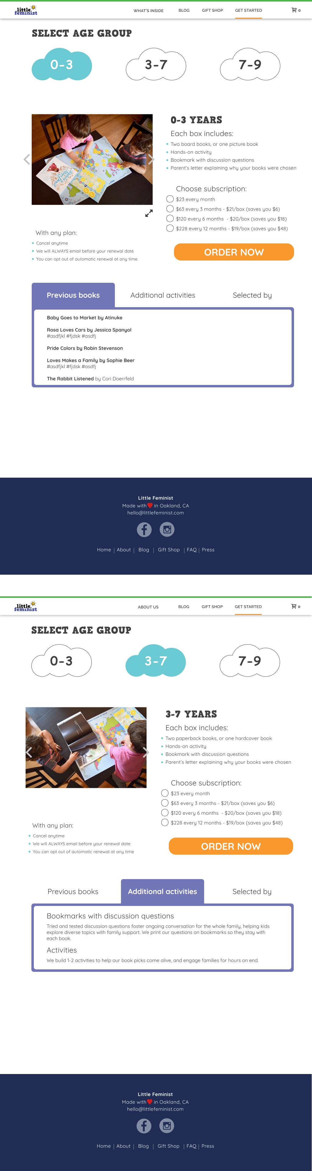
Product page
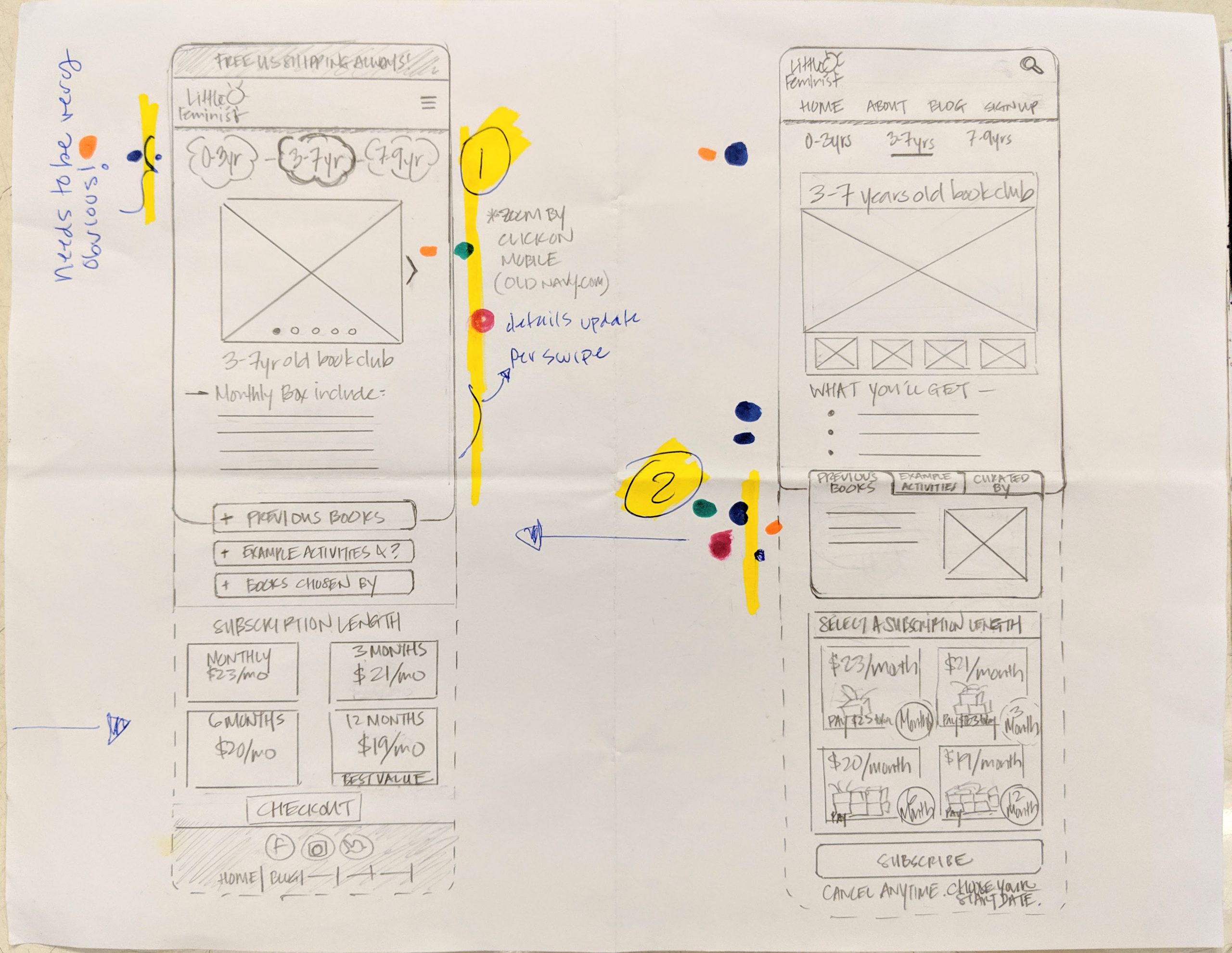
5. Testing design iterations
Once again, we performed remote 1:1 testing with another 7 users. Although there were noticeable improvements, namely the clear CTAs and ease of navigation between homepage to product page which met users’ expectations, we found that the product offering and subscription description required further clarification and I also learned that providing too much information causes as much friction as not providing sufficient information. We went back to the drawing board and iterated on our designs once again - below are selected screens from the final designs.
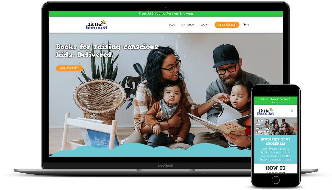
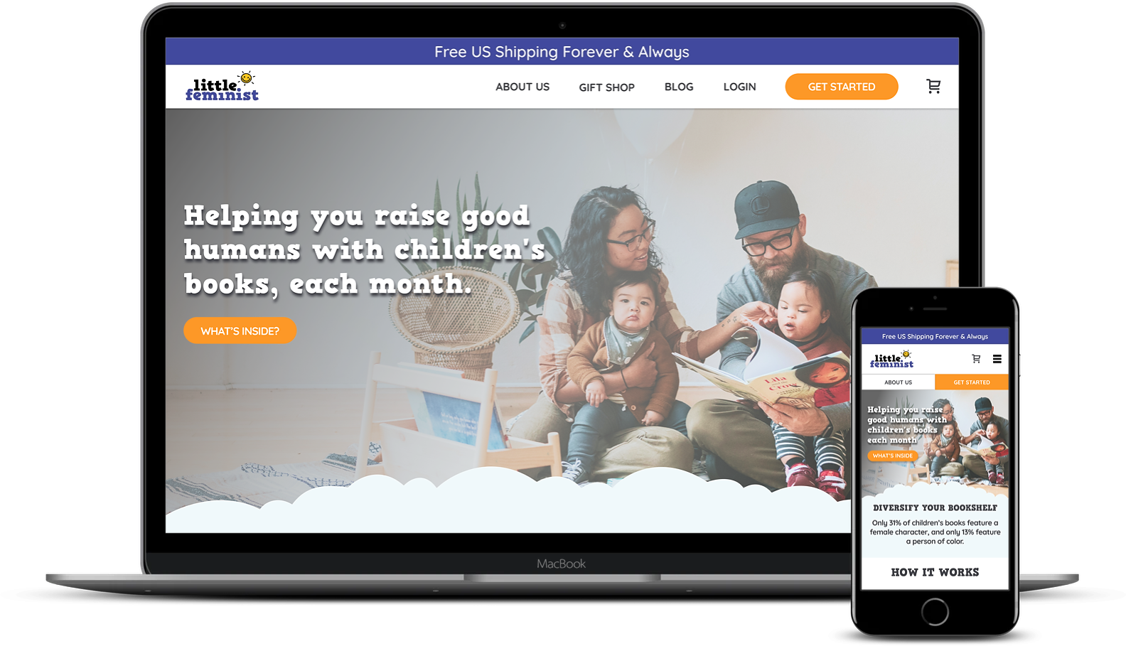
Before & After: Landing page Hero and CTA
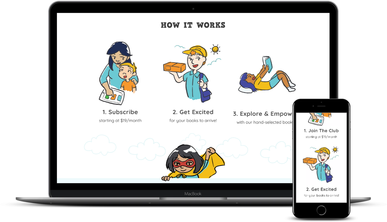
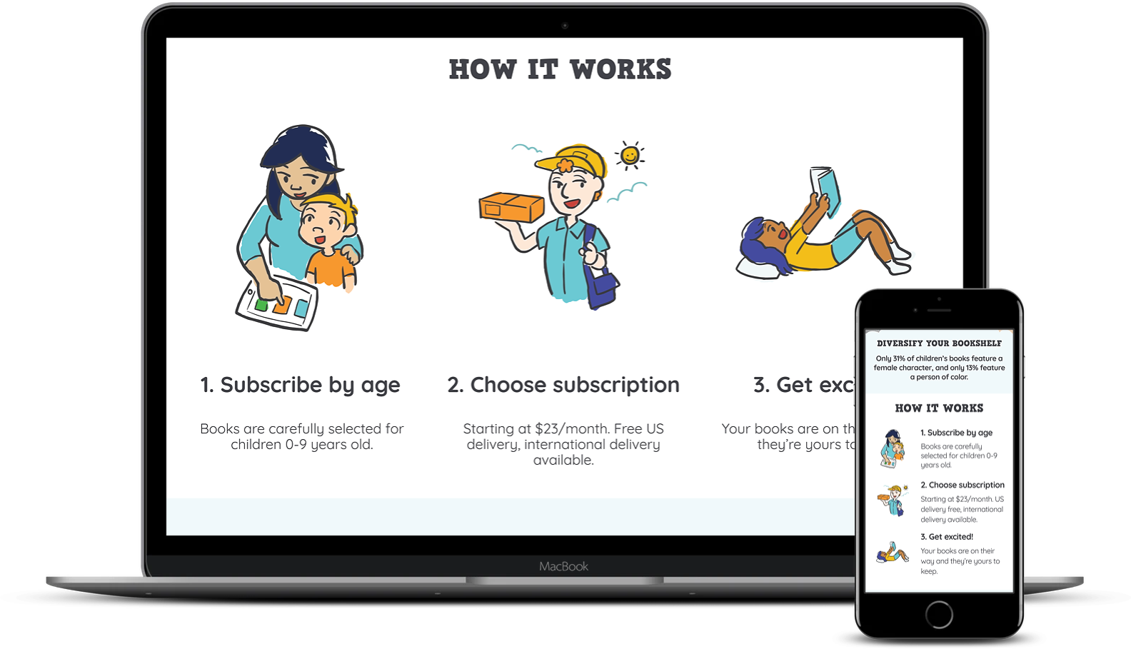
Before & After: Landing page - How it works
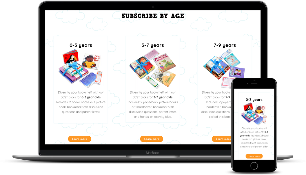
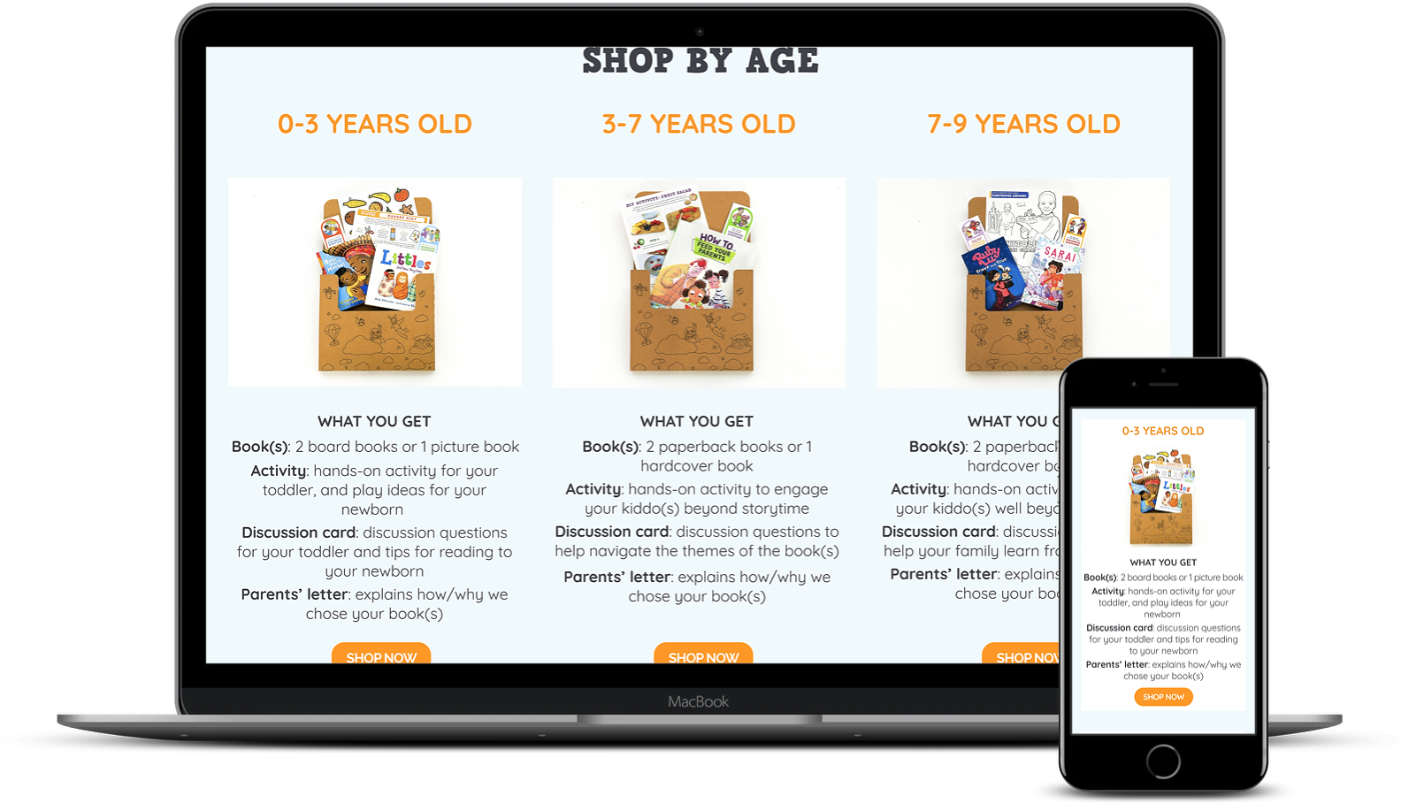
Before & After: Landing page - Product listing
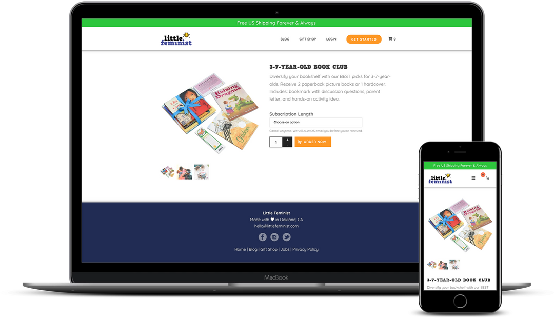
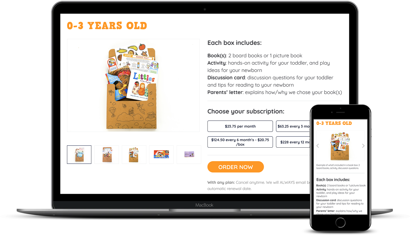
Before & After - Product page
6. Reflections
A total of 9 designers were dedicated to working on this project, which meant that my co-lead and I were inundated with strong opinions from our team members, stakeholders and users. Although ultimately the design decisions were the team leads’ to make we wanted to ensure that all voices were heard and that we as the leads did not impart any of our own biases into the decision making process.
To combat this we split the team into two, to tackle different areas of the website that we hoped would spread the focus of efforts. I also strongly advocated for all team members to participate in note-taking in as many user sessions as possible to minimize anchor biases one would get from observing one user session. We had many team meetings that involved prioritizing needs, voting on needs and keeping in touch with stakeholders.
If I were to take on a similar project again I would take on more authority on making decisions rather than take on such a democratic approach. This would cut down on a lot of team meetings because if there’s anything I’ve learned from this, it’s that no one wants another team meeting.
.
View selected projects

Global energy companyA platform to update stakeholders in a crisis situation
Ada's ListImproving relationship building for female changemakers in tech
Little FeministClarifying the value proposition to increase readership
SpesatiRedesigning the checkout flow for an international audience


